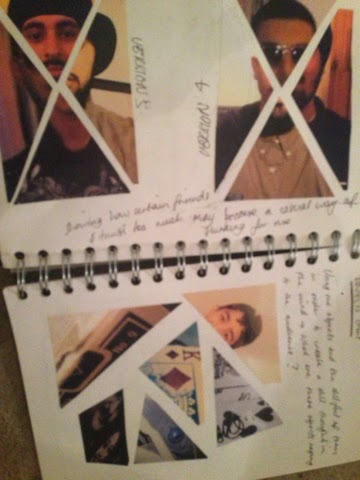
For the final studio day of my first research week I toook the day to gather all my gallery images that I had taken on the wednesday and organised them into seperate sheets so that when referencing in my sketchbook I could clearly show that several visits had been done and also a fair amount from each gallery was used as inspiration. This day I had decided to carry out a few unstructured interviews with 3 friends just to get a sense of what they had thought about the issue of teen stress and how it could be tackled in a form of graphic design. In addition to these chats I also asked what they thought of escapism when stress had reached high levels and they had all made a link to imagination, allowing me to look into how imagination could be a potential pivotal part in my developments and also my final outcome. Ofcourse the Friday I started also to make small drafts on a questionnaire that I would be sending out in order to find what issue that young people had found most stressfull whether parental divorce, self harming ect. This questionnaire will be completed on the monday and sent out of the course of the week in which I will shortlist either 1 or 2 most popular problems with young people to carry on into my development stages.
On the friday I also asked how people would look at my project whether it would be a brand, campaign, book, poster ect. The general response from most peers was that my project was very similar to that of a campaign which could make good use of photography, and that a brand would be slightly convuluted. As I had also expected a campaign was definately what I wanted my outcome to be, and this in my developments could further be either a series of posters/illustrations or even a short film, as I had left my brief to be quite open and not restricted at all. Week 2 I will be looking more into reading the theory side of teen stress and pressure as well as collecting results from my online survey to finalise my topic issues.
Sunday, 22 March 2015
Final Major project week 1 - Day 2
For the second day I took the day to visit several galleries in Central London which had related to the kind of theme I wanted to explore. Firstly I visisted the Serpentine gallery in which I found some very interesting paintings which gave off the image of surpression and being held back. As I did not expect to find these images at the Leon Golub: Bite your tounge exhibition I thought it would be a great oppertunity to see the rest of it and check if there were any more works that had some relation to my project. One thing I found very interesting about this particular exhibition was that the works had a very distorted and eerie feel to them, which at a point had made me consider having a similar outcome later in my development stages. However as my project was more of a motivational thought process than a distortion encouraging one I found that this would only be touched upon slightly in my developments.
Later in the day I visted the Tate Modern in order to see my exhibits in the Poetry and Dreams, and Surrealism and Beyond sections which had many examples of black and white photography, Lithographic prints and acrylic paints which related to the whole idea of dream and distortion. An interesting aspect about the poetry and dreams section was that one work known as ''The Reckless Sleeper'' had inspired me to explore more into the darker side of intability within young people, which will come further on in my research. Unfortunately later in the day I had intended to visit Grayson Perry's work in the national pportrait gallery however had found that the exhibition had been closed therefore making viewing impossible. To overcome this I will be looking online at the works instead of in person and also watching the documentary that was put out by Grayson called ''Who Are You?'', to add to my own understanding of how the self can be percieved.
Overall I found that my gallery visits were successful aprt from the fact that I had failed to visit the Barbican due to my own time constraints. However several peers who were able to visit the Barbican were able to collect some images for me which I will later use in my developments process as they were very interesting as pieces of graphic design and how my outcomes could be layed out.
Final Major Project Week 1 Day 1 - Research
For the First week of the final Major project I begun to think about the different ways in which I could look at my project. On the 16/03/2014 I decided to start off my research by carrying out online research on various articles as evidence that my issue of mental instability amongst teenagers had actually existed. My reason for having to prove this was due to one of the tutors assuming that I had only made a generalisation about teenagers from my own friends and that this was not actually something that was a major problem to be shown graphically however after a talk and show of some of my research she agreed that this was a real life problem. In addition to my gathering of articles of the issue I looked online to find gallery exhibitions that had related to the kind of imaginative and abstract mind of a teenager. I found several and later in the week had gone to visit them.
Later in the day I thought it would be sensible to look into some books on self identity and perception in a sociological/psychological approach therefore used the books 'Modernity and Self identity' and 'interpersonal perception in order to find some theory behind the thoughts of a mind and how it could be affected, allowing me to brainstorm my initial ideas with things such as methods of escapism and causes of depression ect. In addition to this I thought it would be useful to organise a very small group of 4-5 people for the wednesday to talk about what they had thought was very important about how young people stress could be tackled in a graphic way and what would came to thier mind when told about methods of escapism from stress.
Later in the day I thought it would be sensible to look into some books on self identity and perception in a sociological/psychological approach therefore used the books 'Modernity and Self identity' and 'interpersonal perception in order to find some theory behind the thoughts of a mind and how it could be affected, allowing me to brainstorm my initial ideas with things such as methods of escapism and causes of depression ect. In addition to this I thought it would be useful to organise a very small group of 4-5 people for the wednesday to talk about what they had thought was very important about how young people stress could be tackled in a graphic way and what would came to thier mind when told about methods of escapism from stress.
Tuesday, 10 March 2015
Photography
Recording:
When given the task of taking photos relating to a word, I thought it would be sensible to relate this to my time project slightly. In the case of the time project I thought I would relate the photos I took to thosse relating to the word fragments. The context of this word was fragments of my life that had been very influencial in the past, as well as now. Whilst taking my photos of various things I found it slightly challenging as I had not experienced any kind of photography on a project of this scale. Unfortunately I did not have access to any expensive camera equipment therefore I had to take any and all photos with my mobile phone. An interesting thing about this however was the fact that I was able to use different camera and phone effects to add different colours and meanings to my images. Out of all the images I took I decided that 9 would be a suitable amount for my project. In my sketchbook I found that it was quite a tricky challege of cancelling down my photos, however it was an easy task because I was thinking too much of what a photographer would think of my work, rather that what I saw in my own work and the possibilities that could come out of it.
Reflecting:
Looking back over the project, I found that it was one of the most interesting projects I had taken on so far. From a young age I always wanted to see more into how a photo could change someones perspective on a situation and the different emotions it could invoke. Through this project another fun aspect was cutting the photos I had chosen and sticking them down in different arrangements to see how each orientation had differed from one another. This to me was no different to my expereimentation in normal graphics projects that I had taken part in, which made it that much easier for me to grasp the hang of photography at a fairly comfortable level. If I were to do this project again If I had more time, I would attempt to see If i could create a photo collage of just friends alone, instead of mixing firends with objects and perhaps creating a body out of each of those friends, with a mixture of males and females. Also if given the permission by my friends I would experiment with using family photos to further see how the word fragmentation could be ddescribed, as I had done so in a very illustrative way with my photos being shaped as shattered pieces of glass.
Contextualising:
When looking at contextual inspirations for this project I found that robert mapplethorpe was the most influential artist in getting accross the tone I wanted fragmentation to give. His black and white photography had explored that darker side of how peopl may not have wated to know about certain things or trid to brush them away, and this I beillieve was crucial to my understanding of negative emotions in imagery, even though only one of my photos was black and white out of my set of 9.
Alphabet Letters
In this task we were asked to create an alphabet of our own unique design, by taking inspirations from other fonts or even attempting to try to transform letters into weird new shapes.
Recording:
When carrying out this task I was quite excited that I would get to play around with my own typography, as previously I had a dislike for it and did not know much about how much there actually was to type than just plain straight line fonts. When researching befroe my mark-making, I found several very useful books on transforming typography into different forms and shapes. This drew my inspiration towards wanting to do something that was quite unordinary. Firstly I began to list out each letter and then contort and warp it in different ways. This lead me to almost 20 different designs and scribbles for each letter, which were very difficult to choose from as some of them were very unique due to the sheer simplicity of the mark. Others however had a very funky feel to them such as those that had been crated out of shapes such as bubbles and circles, and squares and triangles. Looking back at my studies on mathematics I found that I wanted to crate something that would be mathematical related, so that it could have a very geometric and clever feel to it. After noting down the triangle letters in my sketchbook I began to develop them further into triangles which were purely right angled triangles. This also created a very neat 3D effect that my letters were made of a single folded piece of paper, due to how close I composed each triangle to itself.
Reflecting:
Looking back on this project and the many various attempts of letter transformation that I had tried, I found that I could have possibly gone a little bit further with some of the shapes that I created. One in particular was a letter form I had created by taking the word of how you would say the letter, and using those letters in order to create to actual letter the word was describing. However the problems with taking forward a letterform like this was that it was extremely difficult in order to create a letter that would bare resemblance to what I was trying to show. Any successful attempts had been too small for the eye to see which would have also rendered that particular design useless. In addition to this I felt that the letterforms that I had created were good enough as I had no idea that some of them would create a very cool looking folded paper effect. Also when experimenting with having a white text on a black background instead of vice versa, I found that it wasn't very effective to try and enhance the paper effect. If I were to do this project again I would take small squares and place them in the right angles of each triangle so that it would be apparent what particular type of triangle made up the letter. However If i had done this on the exisiting letters they would be too small to see.
Contextualising:
When llooking at contextual inspirations, some works on fonts appearances to animals from the somerset house gallery had been slightly influencial. However I found that the most helpfuil inspirations in this project were those from books regarding transforming letters and making them look like other objects, however no artists were mentioned in these therefore I was not able to make an very big contextual reference in this project to the typography.
Sunday, 25 January 2015
Campaign
Recording:
For this project we were asked to create a campaign for an issue we felt quite strongly about. I found that during my job as a magician I found it hard to get peoples attention due to them being on thier phones and people in general living a cyber life. in this instance I thought it would be suitable to carry out an anti mobile phone campaign that would help people to connect more to real life rather than living in a cybernetic one. Throughout the week I found that it would be suitable to ask people on how they felt about thier phone and how long they could go without it. Surprisngly most people had answered that it would be difficult even for 30 minutes whilst they were occupied with anyting else to leave the phone alone. Because of this many people had also come to the conclusion that the phone was part of them and that even having a phone that wasnt a smartphone would be difficult for them. Due to this I found that previous campaigns had been done to stop people usiong the phones on the road and areas with fast cars however none were created with the intention of getting people off thier phones completely so they could actually socialise in real life with real people. This in addition to my own survey of asking people how many hours they spent daily on thier mobile phones had pushed me to invesigate the topic further. Looking at works on the distinction between man and machine from the Serpentine gallery and that from Gilbert and george I found that my best outcome would be a series of posters and slogans displayed in schools and London undergroud station tunnels where most if not all londoners are ticking away at thier phones.
Reflecting:
Throughout this project I felt very strongly first about the subject choice, and how universal it could be. As mobiles are something that everyone has it would only make sense that this campaign whether a poster or a short movie would be something that would grab the attention of anyone who had a smarphone in thier pocket old or young. Overall with this project I felt that it was difficult to create a logo of the person (myself) wanting to get across this point and also how it could be applied elsewhere and not only just as a poster. Because of this I eventually came to the realisation that my idea of turning it into a possible brand would be extending the project too far and that this would require time looking into oranisations ans such that already investigate these social issues. I then found a strong idea could lie in the use of photography on london underground trains and the sides of the trains. This could create a very thought provoking state of mind within pople looking at it if the campaign were to be portrayed or used as such as people daily on trains do nothing but pplug into thier smartphones. In this case the use of photography on actual forms of transport could be very effective. One of my outcomes being a poster with my slogan displayed on the top and bottom I felt was very effective through the use of black and white imagery. In addition the fact that the photo I took for one of the posters showed different ways of accessing information (Books and Mobiles) also made me think that this could invoke a subliminal thought in my audiences mind on how they see themselves when it comes to thier own social interactions and how a mobile phone has taken that away from them.
Contextualising:
When looking at contextual sources and artists for inspiration, my main influence I found was jonathan Barnbrook, who stated that "design should be used as a movement for social change". The work of Barnbrook influenced me on how I could further look into campaign possibilities of making a real difference in society, as the only previous campaign that had been done with technology was a short movie known as "Look Up" on youtube which was uploaded in 2014. In addition to this I found that my sociology studies could play a very influential part of this project, as post modernist sociologists had an objection towards technology saying that it distorted people's vision of what the real world was. This ofcourse led me to research example of Post modern art and Pop art, which related to the issue of technolgical globalisation. Through my research of sociological views of technology and artistic views of modern society, I feel that I successfully contextualised my campaign which had given me a very successful final outcome.
Data Translation
Recording:
In the Data translation project we were asked to carry out a data investigation and represent this data in a unique and graphic way. My subject/data collection was to be carried out on social media and how large they would be ranked in the world if they were countries. At first I was going to use mobile phone addiction as my subject and I had even carried out a survey into asking friends how many hours they would spend per day on thier mobiles. However I felt it would be best to save this choice for the Campaign project that would be the week after. Using the data I found online about current social media population I looked into different ways on how this could be visualised. At first I thought typography could be quite useful however this would make it too type based and I wanted it to be a very visual piece with interesting elements. Looking at a map of the world comparing the populations to those of real countries could be very interesting to have mapped out. However after playing with the idea I found a graph comparing those populations to pictures of countries with the same population could be quite visually impacting. Through this I thought a very interesting way of recording data could be through comparing of countires and how they would rank in population against these social media sites, and also by using a mathemtical approach of seeing how males and females each shared a certain percentage of a social media site. Past examples of data representations that I found on places such as deviantArt, behance and google also influenced my work to have a final outcome which would look very modern and not like an old style simple graph or similar.
Reflecting:
Throughout the week I was slowed down in this project mainly due to carrying out an investigation and then changing the subject mid week. Because of this I was very pressed for time and still haden't reached a final outcome. owever when lookinh into the work of Jonathan Barnbrook I found that a very simplistic way that I could represent my data could be through the use of counters instead of typography, which would create a coloured distinction between male and female users, and at the same time show what social media site the datat was respresenting. The very tricky part of this project for me was converting my data into counters, which were represented by one being equal to 10 million men or women. The counter design was also inspired by Jonathan Barnbrook, and the use of hot pink and blue created a very vivid final outcome displayed on a black background. Being a previous A-level maths student also helped me to calculate how many counters would represent my data and also how to work out male and female percentages. If I was to change anything with this project it would be my mathematics of the counters representing however many people. Due to some social media sites having extremely low populations when compared to others, it was much more difficult to create the logos for the media sites using the counters without some of them looking too big or possibly even too small. Future improvements would definately include another revised way of trying to put in as much counters as possible for my key yet not so many that it becomes difficult to show without confusing the image.
Contextualising:
This project was very difficult to find contextual inspirations for however an earlier visit to the Saachi gallery provided me with some very small scale but quite interesting illustrations on technology and its effect upon the world. This would help also along with my next project of Campaigning but with mobile phones instead of social networks being the main topic at hand. In addition the work of Jonathan Barnbrook was very influential in how my type was directly related to the issue of my campaign, and also how the campaign and design in general should be used as a movement for social change within society.
Mapping
The mapping project was by far the most difficult project and the one I had the most troubles with. This project consisted of having to map out an area in a unique and graphic way that related to what I wanted to show on the Map. From a recent visit to new york last year I found that it would be interesting to do a map of times square and its buskers and magicians that resided in the area. This also related to my own personal job as a close-up magician therefore I found it would be interesting to see how I could visulaize performance hotspots. Looking at many maps of new York I found that using a playing card would be very interesting as coincidently the middle of the Jack of Diamonds when compared to the cross roads in times square had looked very similar to one another. This would also fit in with the theme of me wanting to map out magicians and where they had resisded or performed in the area.
Reflecting:
Over the course of the week I had found the process very difficult for this project. However once I started looking at ways of relating this to the shape of a playing card I found ideas slowly forumalting and how I could represent this in a very tricky way. Also as magicians were the main citiznes/hotspots of my maps I also played around with the idea of using them in a way that they were represented by optical illusions. This way it would also be as if they didnt want those looking at the map to know where they were, or to make it a challenge to find them which would be a trick in itself.
Contextualising:
When looking for contextual inffluences in my project research I found that MC Escher and Bridget Riley provided a very good idea that also related to my subject of magic. Tesselations work had also made it quite interesting as I had an idea to create the maop or part of the map using tesselations of Top hats which would be very unique. After looking at these artists I was also inspired on how I could make this map more interactive with users by perhaps embedding a lenticular effect that would make it even more of a visual piece.
Passage of time
Recording:
Over the christmas we were asked to carry out a project communicating the idea of time. When reading the brief I instantly had sevral ideas come to mind on how time could be represented. In a negative tone I came up with the idea of representing time as a very precious thing that should not be wasted, as many people these days waste time for the sake of not wanting to do anything. Because of this I knew that my final outcome would result in being something very emotive and thought provoking especially in the eyes of my peers. Experimenting with photographs of eye was one of my first ideas, in that the eyes see so much over the course of a human life that it could almost be looked at as a memory bank. In addition to this I felt that the use of silhouettes would accompany the photograph of the eye very well as they did not have any detail you had to pay attention to yet still showed clearly what was happening in each image. Using these silhouettes I experimented with the colour of the eye photograph and eventually came to a point where just the colour of the pupil of the eye was visible in blue whilst the rest was black and white. In this instance it reflected how a human eye would have the colour fade after time run out whilst having the main events of that persons lifetime being remembered in silhouette form. (Wedding, birth, death)
Reflecting:
Over the course of the 4 days that I worked on this project I found that this project could have much more done to make it even better. Even though I liked the outcome iof the eye losing its colour due to death and remembering flashbacks I felt it could be taken further. Through this I thought that I could relate the project directly to myself and teenagers in general. This idea being how as children growing up would create bad habits such as drinking or even drugs in some case and how the younger self would view us if they were to see themselves in the future. At this point I found that experimenting with paper to make it look old could also be quite effective along with a mirror which would act as 'the looking glass self' to see your own future version. Experimenting with this I also found that it would make it look like an ol;d relic due to the effect of the paper which could further illustrate the passage of time.
Contextualising:
When looking at contextual research examples for this project unfortunately I had struggled to find anyone that would be very influential in my work. However a current artist known as Inquisitive was very influential in the style that I wanted the illustration to look like. In this case I had therefore decided that this would be my main influnce throughout the project.
Transgression
Recording:
When this project began I had no idea on what I would make the transgressive subject about. However coming from a sociology background in my A-levels I had found thay Capitalism would be the perfect issue on transgressing. Looking through my old textbooks and such I found much influential topics that could be talked about and at the same time could be very controversial if looked at by others who didnt know about sociologist views. Coming from a marxist view I found that it would be perfect to illustrate how capitalism was a very bad thing for society, and yet it occured everyday under peoples noses through taxes and big corporations. Throughout the project visits to galleries had given me inspirations on using very strong colours such as reds and blacks which would connote various feelings such as hatred to the audience. When starting the project with my transgression class we were involved in a group conversation where we went very in depth into sensitive topics relating to the world and how human behaviour was changed when exploring these. In addition to this we found it very interesting on how many taboo topics had come up and as a result of this it had left some students feeling very uncomfortable with the discussion. However through this discussion many ideas had been risen on what I could potentially start to talk about when completing my final outcome which i wanted to be an illustration.
Reflecting:
Throughout the project I had found that ideas were sadly not being taken very nicely by one of the tutors. At first the idea consisted of a group effort consisting of trangressing a guy fawkes mask with various issues we had researched such as poverty and crime. As we were creating this idea and seeing the various ways it could have possibly worked out including campaigns that would have been carried out to see bystanders reactions (small scale). Through the second week 4 of us had each tackled a different issue and therefore tried progressing onto seeing what would play out the best as a final piece that we could each use. However due to us having minimal sketches and descriptions to show our idea unfortunately we were told our idea wasn't very good and that we were getting carried away with the idea therefore sadly coming apart due to others opinions. Because of this the group had disbanded and halfway through the second week we each came up with a new issue to tackle. Me sticking to capitalism as I had before the group had come together had resulted in a very bad group critique which resulted in me doing the project again. Only having one day or so to come up with an outcome my final piece for the project final day was extremely rushed and did not really have a very professional feel to it, looking more like a typical poster that street protestors would have put up. The third time I had done this project I was much happier with the outcome as it was illustration based which changed it up from my usual graphic style artwork, which embedded with a type and transgressive guy fawkes mask had created. However looking at my final illustration now i feel that my type message on the sides of the page could be white to make it stick out even more. This was due to the black looking too dark as it had showed up on the computer well however on print seemed like it was intended to be hard to see, which of course was something I couldn't have anticipated.
Contextualising:
At the start of the project a visit to the Saachi Gallery had given a very influential inspiration on how we could trangress different things. One particular artwork that consisted of blood red patterns was the main influence behind the background of my illustration. The visit provided us with many weird things to view, including a room where the floor was made entirely of oil even though we had thought it was mirrored.In addition to transgressive works at the Saachi gallery I had found that my previous visit to Gilbert and George's scapegoating pictures greatly helped me when expressing my issue. As I was looking into a very controversial topic, I found that they were very influential in helping me to come up with ways on how I could express my illustration without worrying about what judgements it would come under by others.
Skella Skateboarding Branding Project
Recording:
Over the course of the 2 weeks we were asked to create a unique brand that communicated something new and non existant in our own graphical way. At first I was going to make this a company related to selling magic tricks however later changed my mind as I thought it would be much better to communicate an old interest of mine: Skateboarding. From a young age skateboarding was a very favourite sport of mine so I thought it would be interested to see what I could come up with as I haven't touched a skateboard in many years now. When researching into various skateboard brands that had already existed I found that most had used bright colours and images to communicate the youngster who would be riding it accross. This was a strong point for me being interested in very visual and funky graphics, therefore the skateboarding brand would be a perfect place to start my own brand. After talking to many skaters as well I had found that they would be interested in seeing how I could design a brand and how they would react to it if it were a real product or Brand.
Reflecting:
Having to look like a professional brand I knew that this would have to be a computer rendered logo and not a hand drawn one. However as I was becoming very comfortable with photoshop in recent weeks using computer rendering for this task would be no problem at all. When drawing up the initial ideas on how the logo would look I felt that using existing logos as a guide would be perfect for this. Not just skateboarding brands but restaurants, gaming and many other brands were very influential in how I could have possibly allowed my own design to turn out. I also found that by looking at other brands it was possible to see how I could use them and if there were any patterns of layout when it communicated a particular theme for example foods and gaming. While working thrrough the project the name Skella was a very clever one as it had related to me very directly therefore sounding very sleek (inspired by skeletor). My gripe was creating a typeface or using a typeface that would be suitable as I had no previous experience of typography at all within graphic deisgn. However when I played around with a few texts and ideas that I had in mind, I was very pleased to have created my own typography font for the brand, with it clearly looking like something Hip and Young which is exactly what a skateboarder would like on thier clothing or skateboard deck. After various experimentations with how large it would be and how my logo would be layed out I was extremely pleased to have created a fully rendered computer logo for the first time.
Contextualising:
When looking into this branding project at the research stages I found it quite difficult to get any contextual inspirations on how I could relate my artwork to this. However as skateboarding is a very modern sport I felt that post modern pop art would be perfectly suited to help me. Through using this it gave me a very strong outcome as my logo had also looked like a very funky and modern piece of artwork. However, I was able to look into various skateboard movies by some old graffiti artists for influences, as I could not find any contextual inspiration on street art or branding yet it was much better to have a contemporary example of research and analysis of my choice involved with this project
Subscribe to:
Comments (Atom)