For the final studio day of my first research week I toook the day to gather all my gallery images that I had taken on the wednesday and organised them into seperate sheets so that when referencing in my sketchbook I could clearly show that several visits had been done and also a fair amount from each gallery was used as inspiration. This day I had decided to carry out a few unstructured interviews with 3 friends just to get a sense of what they had thought about the issue of teen stress and how it could be tackled in a form of graphic design. In addition to these chats I also asked what they thought of escapism when stress had reached high levels and they had all made a link to imagination, allowing me to look into how imagination could be a potential pivotal part in my developments and also my final outcome. Ofcourse the Friday I started also to make small drafts on a questionnaire that I would be sending out in order to find what issue that young people had found most stressfull whether parental divorce, self harming ect. This questionnaire will be completed on the monday and sent out of the course of the week in which I will shortlist either 1 or 2 most popular problems with young people to carry on into my development stages.
On the friday I also asked how people would look at my project whether it would be a brand, campaign, book, poster ect. The general response from most peers was that my project was very similar to that of a campaign which could make good use of photography, and that a brand would be slightly convuluted. As I had also expected a campaign was definately what I wanted my outcome to be, and this in my developments could further be either a series of posters/illustrations or even a short film, as I had left my brief to be quite open and not restricted at all. Week 2 I will be looking more into reading the theory side of teen stress and pressure as well as collecting results from my online survey to finalise my topic issues.
Sunday, 22 March 2015
Final Major project week 1 - Day 2
For the second day I took the day to visit several galleries in Central London which had related to the kind of theme I wanted to explore. Firstly I visisted the Serpentine gallery in which I found some very interesting paintings which gave off the image of surpression and being held back. As I did not expect to find these images at the Leon Golub: Bite your tounge exhibition I thought it would be a great oppertunity to see the rest of it and check if there were any more works that had some relation to my project. One thing I found very interesting about this particular exhibition was that the works had a very distorted and eerie feel to them, which at a point had made me consider having a similar outcome later in my development stages. However as my project was more of a motivational thought process than a distortion encouraging one I found that this would only be touched upon slightly in my developments.
Later in the day I visted the Tate Modern in order to see my exhibits in the Poetry and Dreams, and Surrealism and Beyond sections which had many examples of black and white photography, Lithographic prints and acrylic paints which related to the whole idea of dream and distortion. An interesting aspect about the poetry and dreams section was that one work known as ''The Reckless Sleeper'' had inspired me to explore more into the darker side of intability within young people, which will come further on in my research. Unfortunately later in the day I had intended to visit Grayson Perry's work in the national pportrait gallery however had found that the exhibition had been closed therefore making viewing impossible. To overcome this I will be looking online at the works instead of in person and also watching the documentary that was put out by Grayson called ''Who Are You?'', to add to my own understanding of how the self can be percieved.
Overall I found that my gallery visits were successful aprt from the fact that I had failed to visit the Barbican due to my own time constraints. However several peers who were able to visit the Barbican were able to collect some images for me which I will later use in my developments process as they were very interesting as pieces of graphic design and how my outcomes could be layed out.
Final Major Project Week 1 Day 1 - Research
For the First week of the final Major project I begun to think about the different ways in which I could look at my project. On the 16/03/2014 I decided to start off my research by carrying out online research on various articles as evidence that my issue of mental instability amongst teenagers had actually existed. My reason for having to prove this was due to one of the tutors assuming that I had only made a generalisation about teenagers from my own friends and that this was not actually something that was a major problem to be shown graphically however after a talk and show of some of my research she agreed that this was a real life problem. In addition to my gathering of articles of the issue I looked online to find gallery exhibitions that had related to the kind of imaginative and abstract mind of a teenager. I found several and later in the week had gone to visit them.
Later in the day I thought it would be sensible to look into some books on self identity and perception in a sociological/psychological approach therefore used the books 'Modernity and Self identity' and 'interpersonal perception in order to find some theory behind the thoughts of a mind and how it could be affected, allowing me to brainstorm my initial ideas with things such as methods of escapism and causes of depression ect. In addition to this I thought it would be useful to organise a very small group of 4-5 people for the wednesday to talk about what they had thought was very important about how young people stress could be tackled in a graphic way and what would came to thier mind when told about methods of escapism from stress.
Later in the day I thought it would be sensible to look into some books on self identity and perception in a sociological/psychological approach therefore used the books 'Modernity and Self identity' and 'interpersonal perception in order to find some theory behind the thoughts of a mind and how it could be affected, allowing me to brainstorm my initial ideas with things such as methods of escapism and causes of depression ect. In addition to this I thought it would be useful to organise a very small group of 4-5 people for the wednesday to talk about what they had thought was very important about how young people stress could be tackled in a graphic way and what would came to thier mind when told about methods of escapism from stress.
Tuesday, 10 March 2015
Photography
Recording:
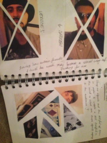
When given the task of taking photos relating to a word, I thought it would be sensible to relate this to my time project slightly. In the case of the time project I thought I would relate the photos I took to thosse relating to the word fragments. The context of this word was fragments of my life that had been very influencial in the past, as well as now. Whilst taking my photos of various things I found it slightly challenging as I had not experienced any kind of photography on a project of this scale. Unfortunately I did not have access to any expensive camera equipment therefore I had to take any and all photos with my mobile phone. An interesting thing about this however was the fact that I was able to use different camera and phone effects to add different colours and meanings to my images. Out of all the images I took I decided that 9 would be a suitable amount for my project. In my sketchbook I found that it was quite a tricky challege of cancelling down my photos, however it was an easy task because I was thinking too much of what a photographer would think of my work, rather that what I saw in my own work and the possibilities that could come out of it.
Reflecting:
Looking back over the project, I found that it was one of the most interesting projects I had taken on so far. From a young age I always wanted to see more into how a photo could change someones perspective on a situation and the different emotions it could invoke. Through this project another fun aspect was cutting the photos I had chosen and sticking them down in different arrangements to see how each orientation had differed from one another. This to me was no different to my expereimentation in normal graphics projects that I had taken part in, which made it that much easier for me to grasp the hang of photography at a fairly comfortable level. If I were to do this project again If I had more time, I would attempt to see If i could create a photo collage of just friends alone, instead of mixing firends with objects and perhaps creating a body out of each of those friends, with a mixture of males and females. Also if given the permission by my friends I would experiment with using family photos to further see how the word fragmentation could be ddescribed, as I had done so in a very illustrative way with my photos being shaped as shattered pieces of glass.
Contextualising:
When looking at contextual inspirations for this project I found that robert mapplethorpe was the most influential artist in getting accross the tone I wanted fragmentation to give. His black and white photography had explored that darker side of how peopl may not have wated to know about certain things or trid to brush them away, and this I beillieve was crucial to my understanding of negative emotions in imagery, even though only one of my photos was black and white out of my set of 9.
Alphabet Letters
In this task we were asked to create an alphabet of our own unique design, by taking inspirations from other fonts or even attempting to try to transform letters into weird new shapes.
Recording:
When carrying out this task I was quite excited that I would get to play around with my own typography, as previously I had a dislike for it and did not know much about how much there actually was to type than just plain straight line fonts. When researching befroe my mark-making, I found several very useful books on transforming typography into different forms and shapes. This drew my inspiration towards wanting to do something that was quite unordinary. Firstly I began to list out each letter and then contort and warp it in different ways. This lead me to almost 20 different designs and scribbles for each letter, which were very difficult to choose from as some of them were very unique due to the sheer simplicity of the mark. Others however had a very funky feel to them such as those that had been crated out of shapes such as bubbles and circles, and squares and triangles. Looking back at my studies on mathematics I found that I wanted to crate something that would be mathematical related, so that it could have a very geometric and clever feel to it. After noting down the triangle letters in my sketchbook I began to develop them further into triangles which were purely right angled triangles. This also created a very neat 3D effect that my letters were made of a single folded piece of paper, due to how close I composed each triangle to itself.
Reflecting:
Looking back on this project and the many various attempts of letter transformation that I had tried, I found that I could have possibly gone a little bit further with some of the shapes that I created. One in particular was a letter form I had created by taking the word of how you would say the letter, and using those letters in order to create to actual letter the word was describing. However the problems with taking forward a letterform like this was that it was extremely difficult in order to create a letter that would bare resemblance to what I was trying to show. Any successful attempts had been too small for the eye to see which would have also rendered that particular design useless. In addition to this I felt that the letterforms that I had created were good enough as I had no idea that some of them would create a very cool looking folded paper effect. Also when experimenting with having a white text on a black background instead of vice versa, I found that it wasn't very effective to try and enhance the paper effect. If I were to do this project again I would take small squares and place them in the right angles of each triangle so that it would be apparent what particular type of triangle made up the letter. However If i had done this on the exisiting letters they would be too small to see.
Contextualising:
When llooking at contextual inspirations, some works on fonts appearances to animals from the somerset house gallery had been slightly influencial. However I found that the most helpfuil inspirations in this project were those from books regarding transforming letters and making them look like other objects, however no artists were mentioned in these therefore I was not able to make an very big contextual reference in this project to the typography.
Subscribe to:
Comments (Atom)